Title: Enterprise Financial Management Dashboard
Role: UI/UX Designer
Tools: Figma, Framer, Google Form, Fig Jam, Banani AI, Stitch AI
Timeline: 3 Weeks
Platform: Web Design
Project Overview
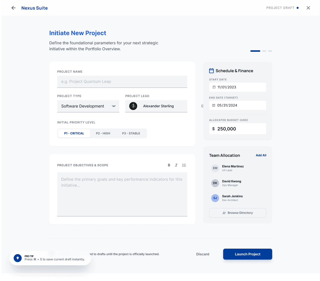
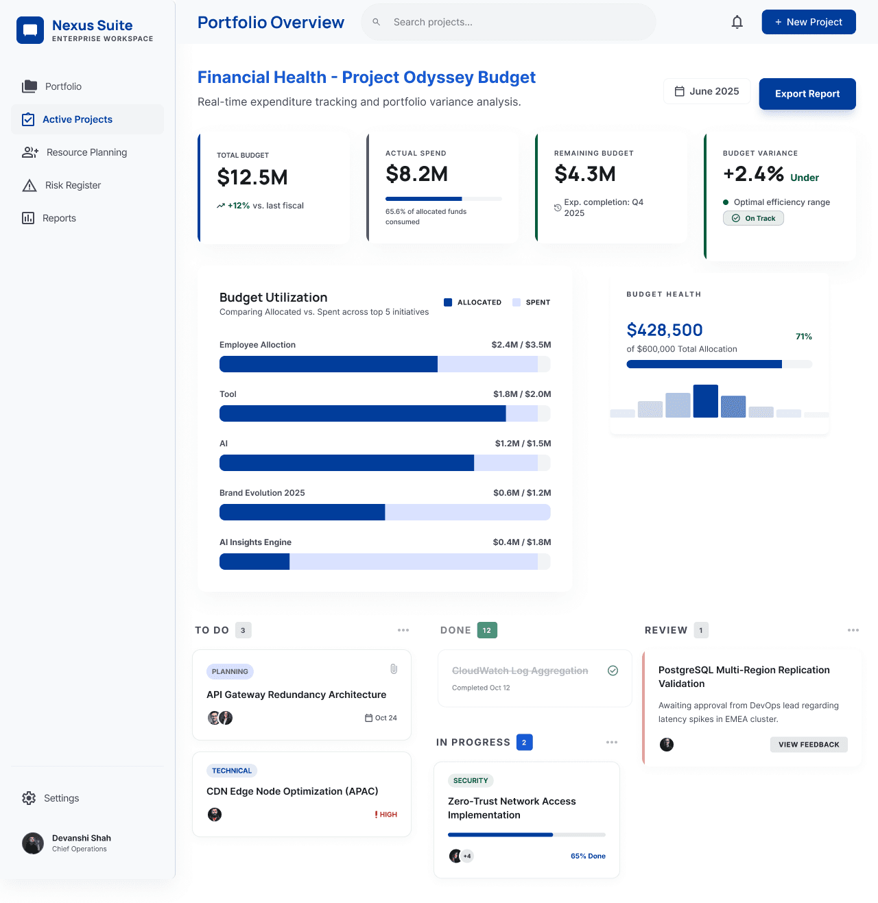
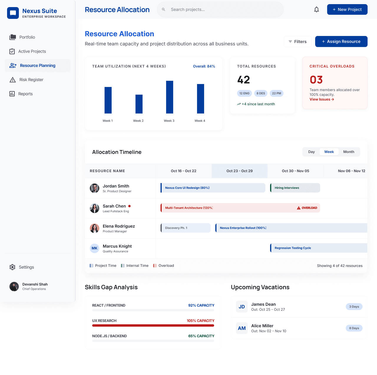
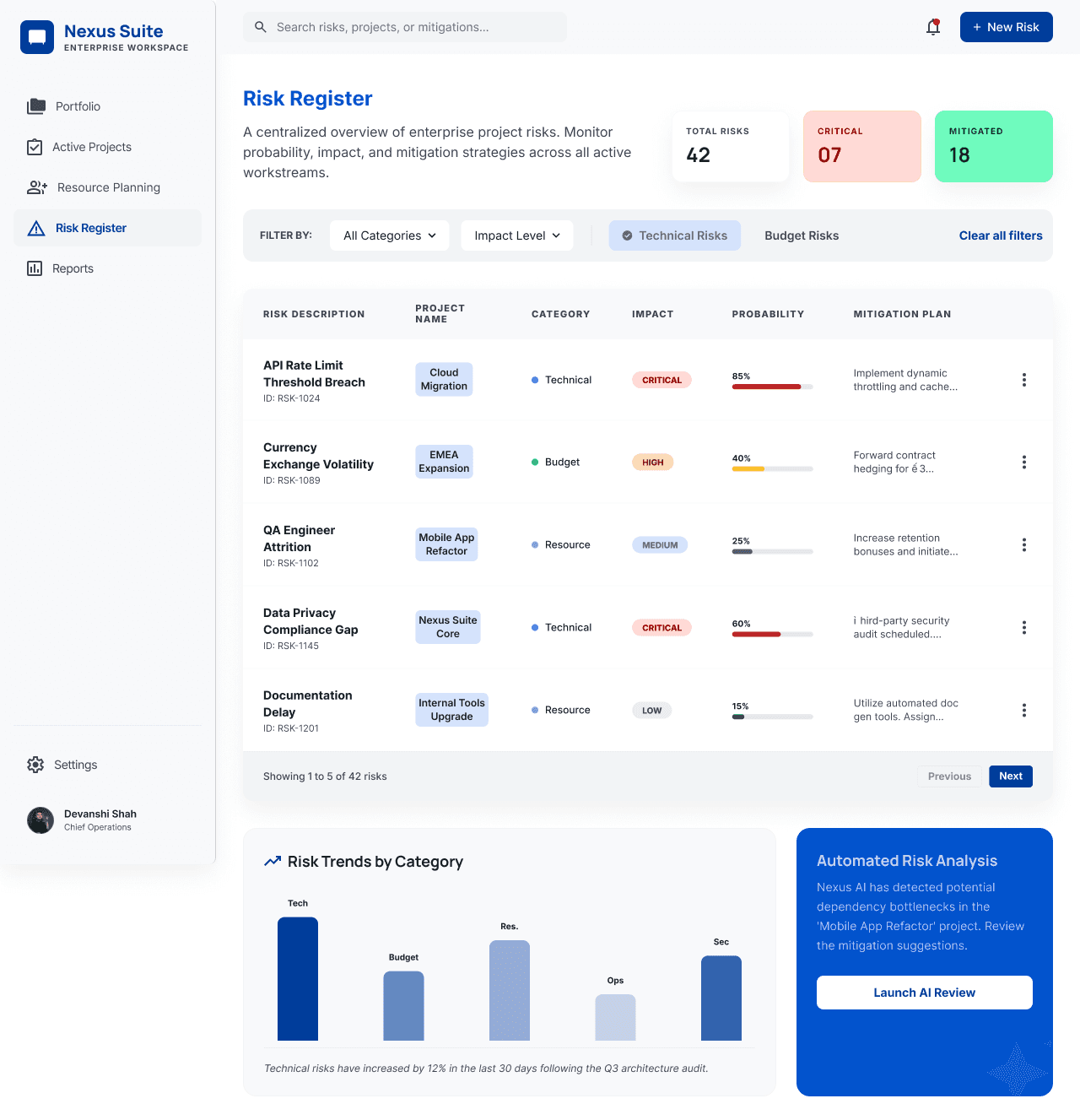
This project focuses on a comprehensive enterprise-level financial management platform. The suite of screens covers the entire lifecycle of financial operations, from portfolio overview and investment creation to risk assessment and reporting.
Problem Statement
Enterprise finance teams often struggle to manage large volumes of fragmented financial data spread across multiple tools. This makes it difficult to gain real-time visibility, track key performance metrics, and make timely, informed decisions. There is a need for a centralized dashboard that simplifies complex data and supports efficient financial management.
Goal:
Design a scalable, user-friendly financial dashboard that provides clear insights and enables faster decision-making.
Key Objectives
The objective was to centralize financial data into a unified dashboard, deliver actionable insights through clear visualizations, streamline key workflows like investment creation and risk assessment, and provide a user‑centric experience for analysts, portfolio managers, and executives.
Design Decisions & UX Rationale
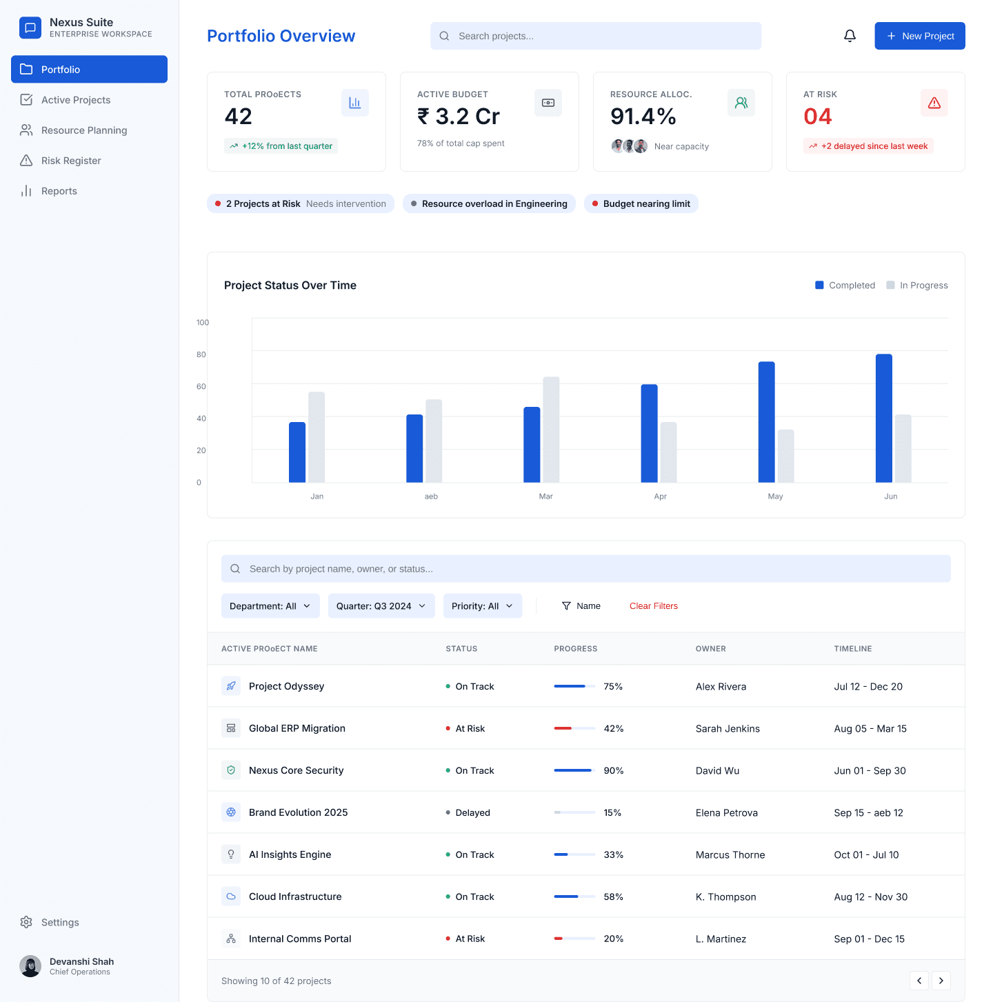
Visual Hierarchy: Sidebar navigation with top-level KPIs ensures quick access to key insights.
Color Palette: Blue and white create a professional feel, with red/green used for clear status cues.
Consistency: A unified grid and typography system reduces cognitive load across screens.
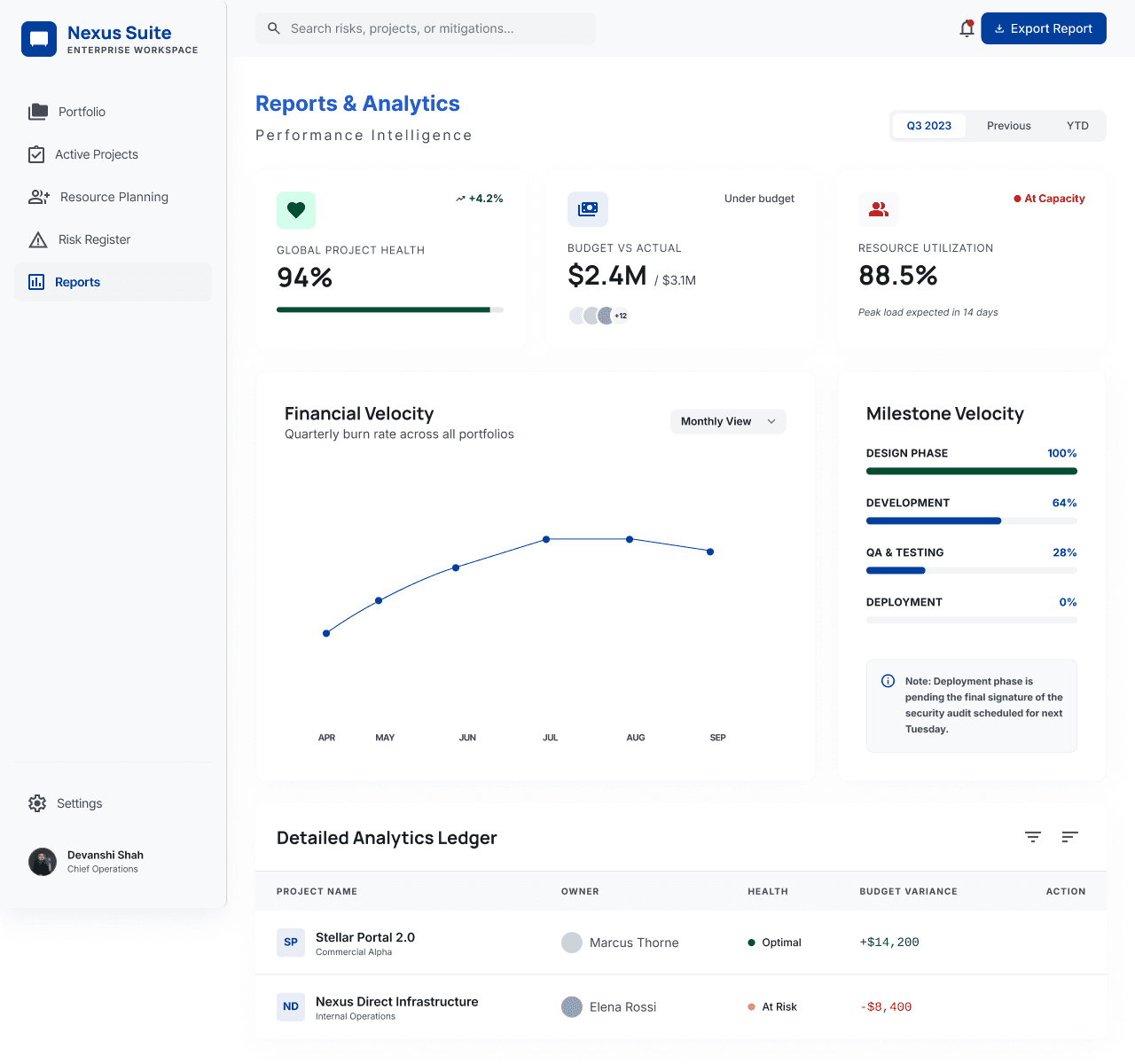
Data Visualization: Charts and progress indicators simplify complex financial data for easy understanding.
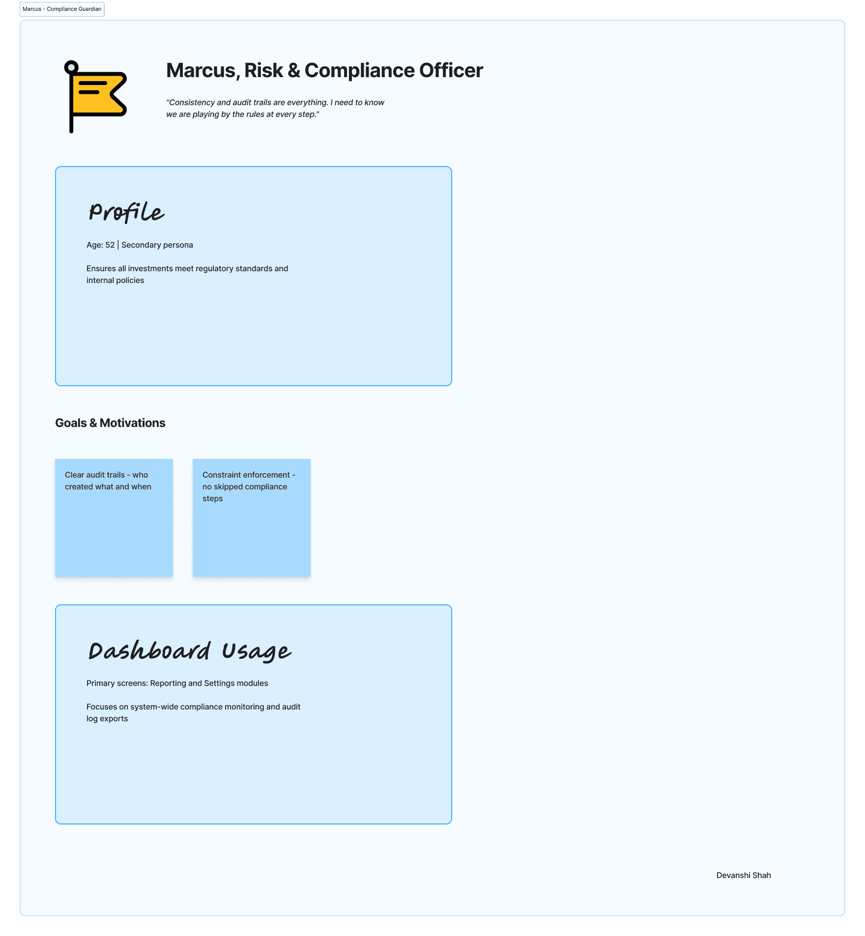
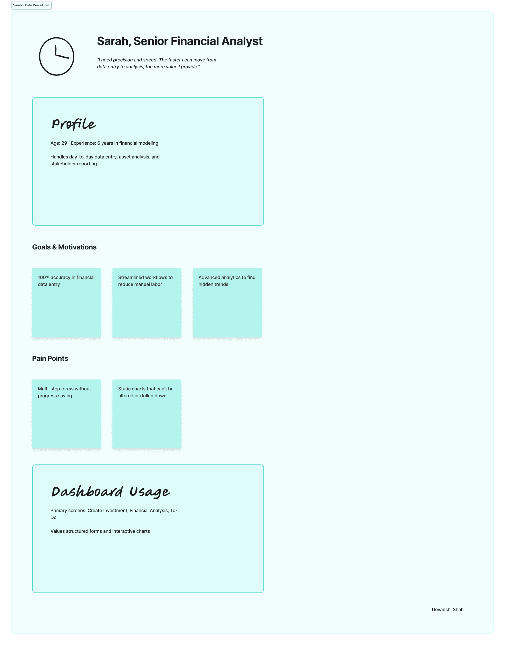
User Persona
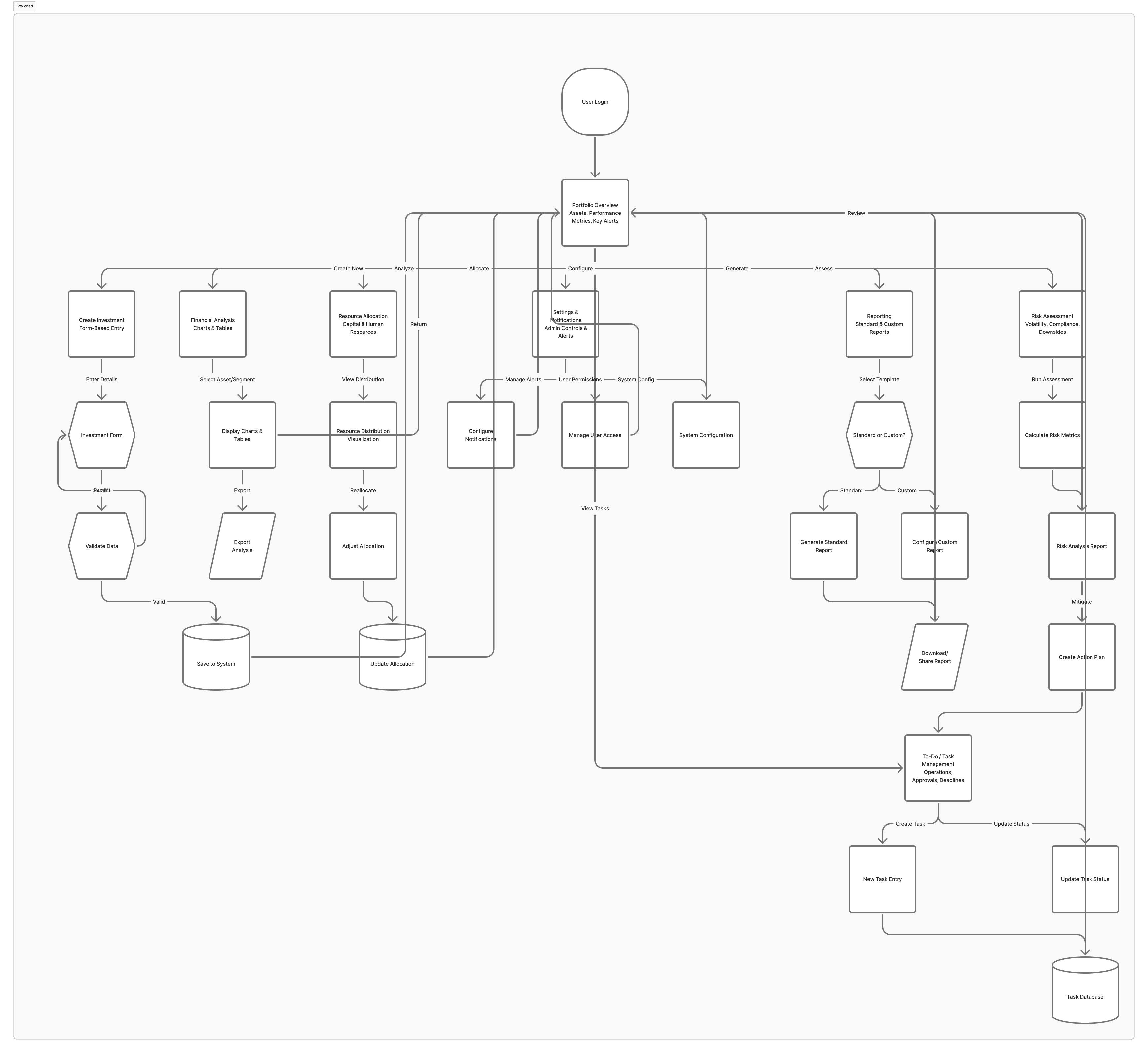
The Screens & User Flow
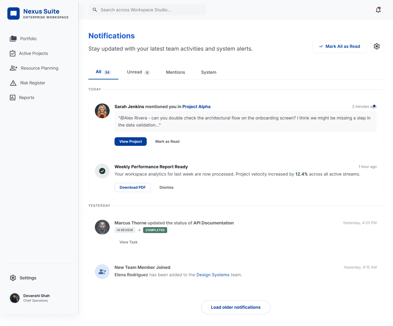
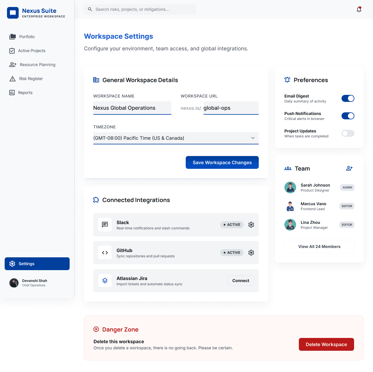
UI Screens
Color Palette
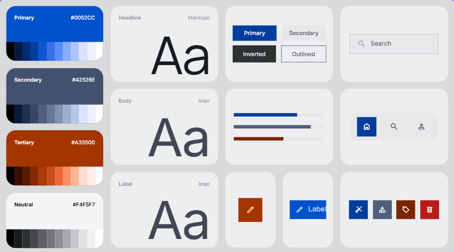
Typography Specimen: Azure Horizon
This document outlines the typographic scales and styles for the Azure Horizon design system, utilizing the Manrope font family.
Typeface: Manrope
Manrope is a modern, geometric sans-serif font that excels in both large headlines and small UI text. It offers high legibility, making it perfect for executive dashboards and data-rich applications.
Type Scale
Headlines
H1 (Bold, 32px / 40px): Used for main page titles.
Example: Dashboard Overview
H2 (SemiBold, 24px / 32px): Used for major section headers.
Example: Financial Metrics
H3 (SemiBold, 20px / 28px): Used for sub-sections and modal titles.
Example: Project Details
Body Text
Body Large (Regular, 16px / 24px): Used for primary content and long-form text.
Body Medium (Regular, 14px / 20px): The default size for most UI elements, labels, and descriptions.
Body Small (Regular, 12px / 16px): Used for secondary information, metadata, and helper text.
Functional Styles
Button (Bold, 14px / 20px): All-caps or title case for action buttons.
Caption (Medium, 11px / 14px): Used for very small labels, such as chart legends or fine print.
Data/Monospace (Regular, 14px): Used for numerical data or code snippets where alignment is critical.
Hierarchy & Usage Guidelines
Contrast: Use weight (Bold vs. Regular) and color (Primary Blue vs. Neutral Gray) to create a clear visual hierarchy.
Alignment: Maintain consistent left-alignment for text blocks to ensure readability.
Spacing: Follow the 4px grid system for line heights and paragraph spacing to maintain a structured "Digital Executive" look.
Conclusion
The dashboard offers a scalable, user-friendly solution that balances high-level insights with detailed control, enabling efficient financial decision-making.
Thank you For Watching
Enterprise Financial Management Dashboard