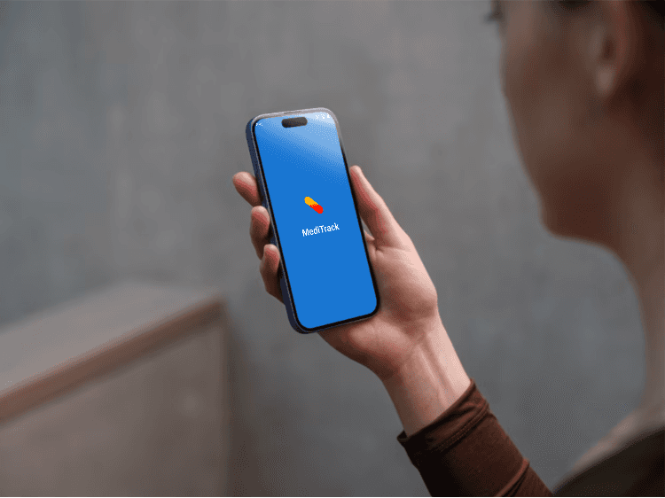
Title: MediTrack Mobile App
Role: UI/UX Designer
Tools: Figma, Framer, Google Form
Timeline: 3 Weeks
Platform: Mobile (iOS & Android)
Overview
MediTrack is a medication reminder and tracking mobile application designed for elderly users and people with chronic conditions who need to take medicines regularly without fail.
The app helps users take medications on time through timely reminders, allows them to reschedule doses, and maintains a clear medication history. Users can also download and share their medication details with caregivers or family members for better support and transparency.
Problem Statement
Many elderly people and chronic disease patients forget to take their medications on time, which can lead to serious health complications.
Existing solutions are often too complex, not senior-friendly, or lack clear tracking and sharing options.
MediTrack was designed to solve this problem by offering a simple, reminder-based experience that ensures users never miss a dose and can easily manage their medication routine.
Goals & Objectives
Track multiple medications
Send timely dose reminders
Allow users to mark medication as taken
Visually track tablet intake history
Remind users when medication supply is low
Help users plan refills in advance
Enable sharing of medication details with caregivers
Research & Insights
Through observation and informal user discussions, I identified two primary user groups:
Elderly users who often forget to take medications on time
Parents of children with chronic conditions who manage daily medication routines
Key problems identified:
Users forget to take medicines on time
Users are unsure whether a dose has already been taken
Medications sometimes run out unexpectedly, causing missed doses
Existing solutions lack refill alerts and clear intake tracking
Design solutions introduced:
A “Took Medication” button to confirm dose intake
A tablet medication tracker to show taken, upcoming, and missed doses
A toggle-based refill reminder, allowing users to enable alerts when their medication supply is running low
When the toggle is ON, users receive a reminder such as:
“Your medication will finish soon. Please purchase a new one.”
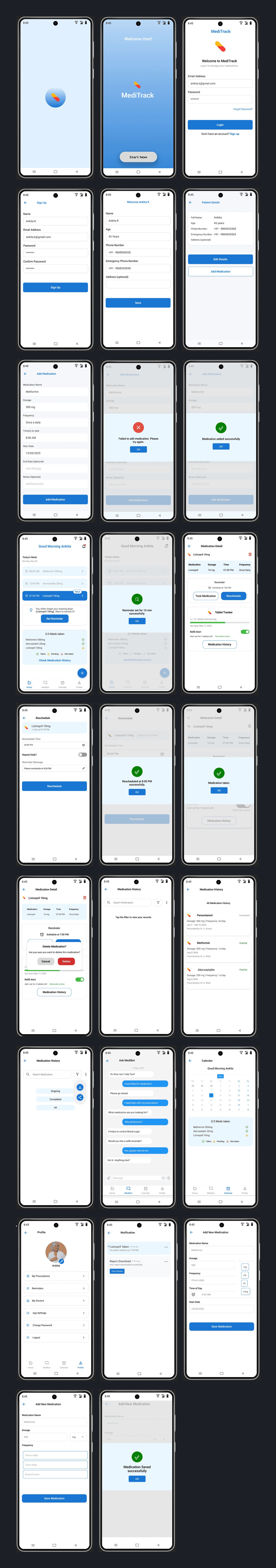
User Flow
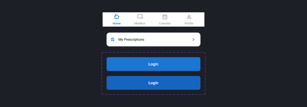
Current User Flow – Home Screen Includes:
Notifications for medication reminders
Today’s medication schedule
One-tap option to set or reschedule reminders
Access to medication history
Add medication option
Navigation Structure:
Bottom Navigation Bar
Home
Medibot (assistance/help feature)
Calendar (monthly medication view)
Profile
Supporting Screens:
Loading screen
Successful medication added screen
Failed to add medication screen
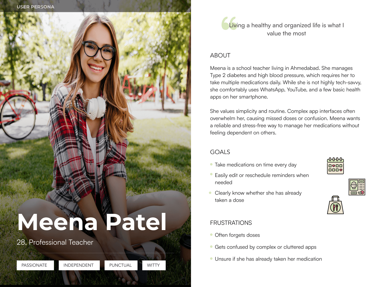
User Persona: Meena Patel
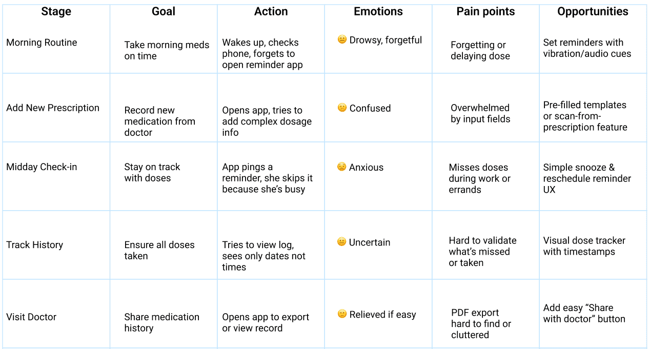
User Journey Map
Persona: Meena, 62 y/o | Manages 5 daily medications for chronic conditions
Empathy Map
Persona: Meena – Retired teacher, managing multiple chronic conditions
🔊 Says🧠 Thinks “I have too many meds to remember.” “I hope I didn’t miss that pill today.” “Reminders don’t always work for me.” “I need a simpler way to track everything.”
👂 Hears👀 Sees “You forgot your BP tablet again!” Too many confusing health apps “You need to take this at exact times” Confusing instructions on prescription
❤️ Feels✋ Does Overwhelmed, anxious, forgetful Ignores reminders, writes notes manually Relieved when app works as expected Uses app to check meds before doctor visit
Design Decisions
Home Screen
The Home screen is designed to provide at-a-glance clarity through intuitive dose cards labeled for Morning, Afternoon, and Evening.
Each card summarizes medications due for that time slot, allowing for quick scanning.
A FAB (Floating Action Button) makes adding a new medication instantly accessible.
Users can also set reminders and check their medication history directly from this screen, streamlining daily tasks.
Add Medication
This screen was built with simplicity in mind to reduce friction.
Minimal, essential form fields ensure fast and error-free data entry.
Clear input labels and pill-type icons enhance usability.
Designed for all users — including those with low digital literacy or cognitive challenges.
Medication History
To foster accountability and easy tracking, the history screen features a scrollable vertical timeline.
Each entry clearly marks missed, ongoing, or completed doses with intuitive icons and color codes.
A kebab menu (three-dot icon) allows users to download or share medication reports, useful for caregivers and consultations.
Accessibility Focus
Inclusive design was a core priority.
The UI follows WCAG guidelines for accessibility.
Implemented high-contrast color themes.
Large, tap-friendly buttons and clean, legible typography ensure usability for seniors and visually impaired users.
Design & Prototyping:
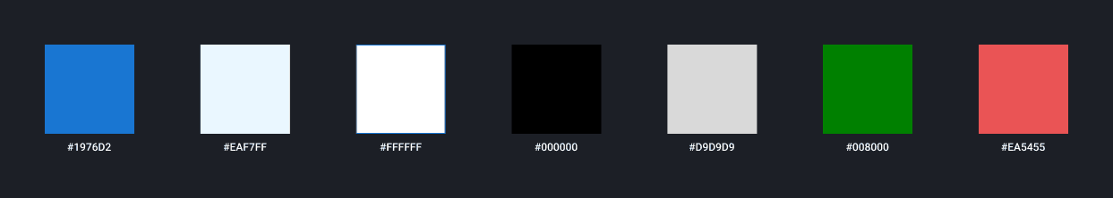
Color Palette:
Component:
Typography:
Style | Font | Size | Weight |
|---|---|---|---|
Heading 1 | Roboto | 20px | Semi Bold |
Heading 2 | Roboto | 16px | Medium |
Heading 3 | Roboto | 14px | Medium |
CTA / Button | Roboto | 16px | Bold |
Body Text | Roboto | 12px | Regular |
Caption | Roboto | 12px | Regular |
Label / Note | Roboto | 12px | Regular |
Outcome
The final prototype offers a streamlined, user-friendly experience tailored to the needs of medication-dependent users. It balances clinical reliability with emotional comfort through soft visuals and clarity.
What I Learned
Designing for seniors taught me the power of simplicity and contrast.
Accessibility features like large fonts and dark mode improve UX for everyone.
Real empathy leads to better design decisions.
Next Steps
Test with real users (seniors, caregivers) for further refinement.
Add push notification flow and integrations with health devices.
Explore a web-based dashboard for caregivers.
“Want to collaborate on impactful health tech? Let’s connect!”
MediTrack - My Dose Schedule